
Role
Product Designer · Bootcamp team of 3
Scope
Scope
End-to-end product design
Duration
2-week sprint
Category
SaaS B2B · fintech
Category
Marketplace · Mobile
About the project
Expense reporting was one of the most requested workflows among Pennylane's Premium customers, making it a key opportunity to improve both employee experience and operational efficiency.
The initial brief focused on simplifying the journey from payment to reimbursement. However, early research challenged our assumptions and uncovered a more fundamental problem.
Before conducting research, we reviewed the existing product context shared by Pennylane:
⏳
21 days
Average reimbursement delay
✈️
100%
Expenses happen on the go
🧾
30%
Need Finance revisions
⭐
#1 request
Premium customer request
This project was completed as part of The Design Crew bootcamp. The challenge was introduced by a Product Designer at Pennylane and based on a real product opportunity the company wanted to explore:
INITIAL SPRINT BRIEF
How might we simplify the expense reporting journey from payment to reimbursement?
01 ———— Discovery
Understanding the problem
Before exploring solutions, we wanted to understand how expense reporting actually worked, where friction occurred, and whether simplifying the interface would solve the real problem.
To build this understanding, we combined competitive analysis, workflow mapping and user research.
🔍
Competitive analysis
Compared leading expense management products, public reviews and feature sets.
🗺️
Workflow mapping
Reconstructed the end-to-end reporting process before challenging it.
🎙️
User interviews
Observed how employees actually capture, submit and track expenses.
We benchmarked more than ten expense management products to understand common workflows, automation patterns and recurring usability issues across the market.
🎯
Common patterns
Automatic receipt capture
🧩
Recurring pain points
Manual categorisation
🔁
Design opportunities
Better visibility during reimbursement

Before redesigning the experience, we mapped the existing reporting journey to understand every decision users had to make, from capturing a receipt to receiving reimbursement.
The mapping revealed multiple context switches, approval stages and manual decisions throughout the journey.
User research
To validate our assumptions, we interviewed five employees with different roles and expense reporting habits. We focused on understanding their workflow, expectations and the biggest sources of friction.
PARTICIPANTS
INSIGHT #1
5 Employees
across sales, finance, product and leadership roles
use signals
Expense reporting frequency
●●●●○ Frequent users
●○○○○ Occasional users
use ●○○○○ Occasional users
Research goals
☐ Workflow understanding
Do users understand the reimbursement process?
☐ Status visibility
Do users understand what happens after submission?
☐ Automation expectations
What do users expect the system to do for them?
☐ Administrative burden
Which tasks create the most friction?


What we learned
Interviews confirmed some of our assumptions while challenging others.
Three consistent patterns emerged:

02 ———— Reframing
Shift in perspective
The challenge wasn't simplifying the workflow. It was reducing the mental effort required to complete it.
This reframing became the foundation for every design decision that followed.



04 ———— V1
Designing the first experience
Our first concept translated the design goals into three design responses, each addressing a different source of cognitive load identified during research.


DESIGN RESPONSE #1
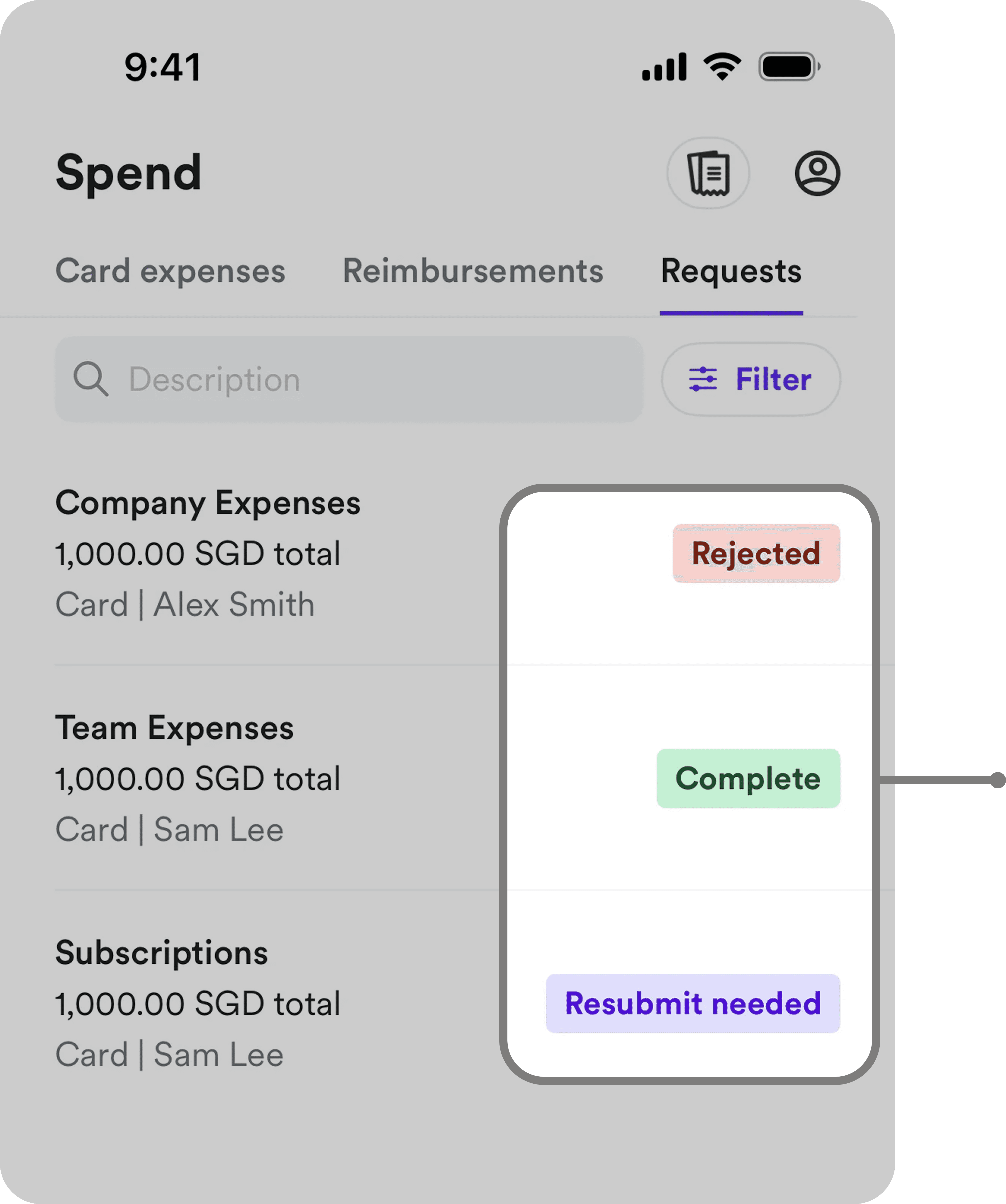
Make reimbursement predictable
Make reimbursement rules, progress and next steps visible throughout the journey.


DESIGN RESPONSE #2
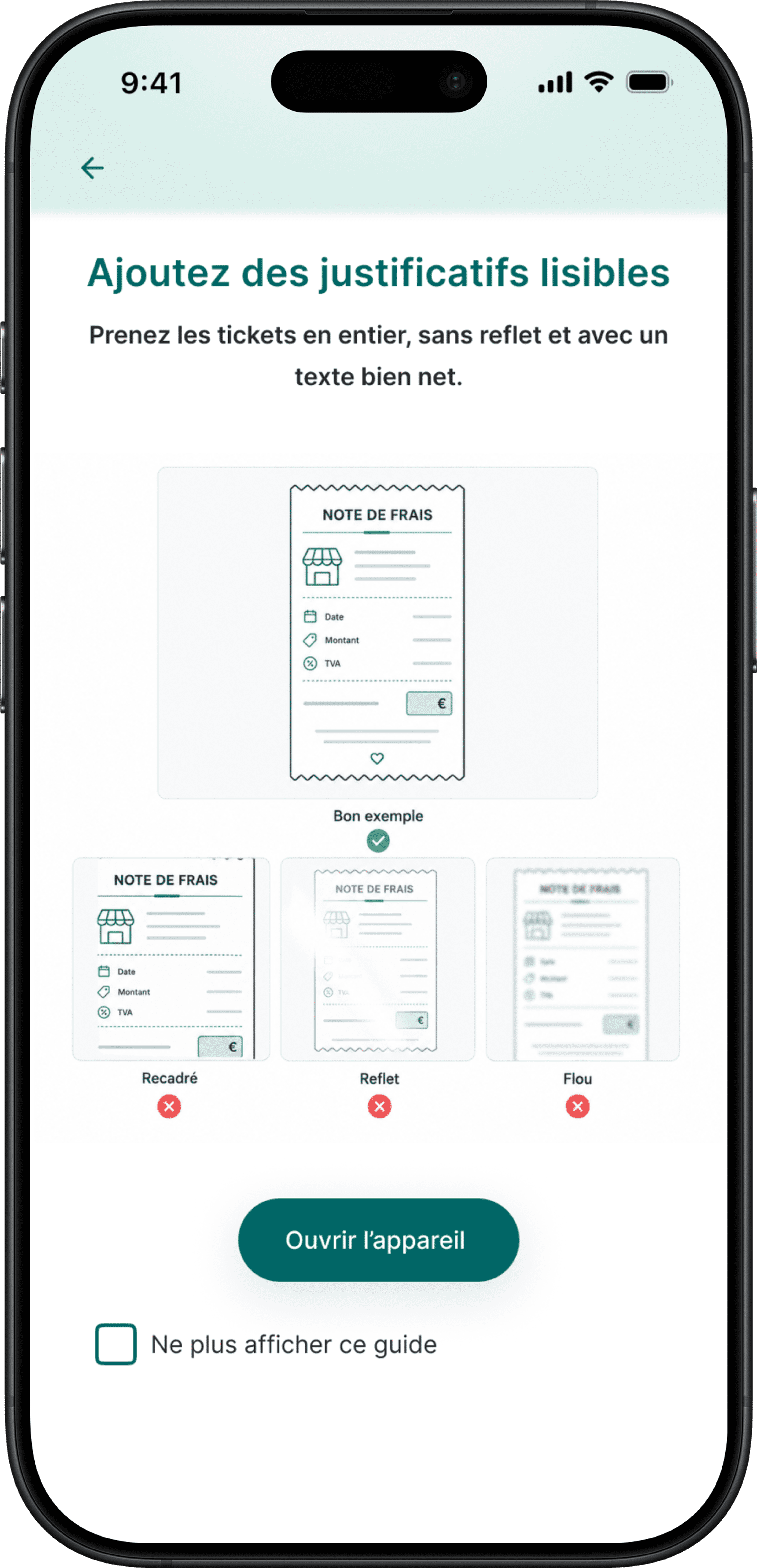
Let the system do the work
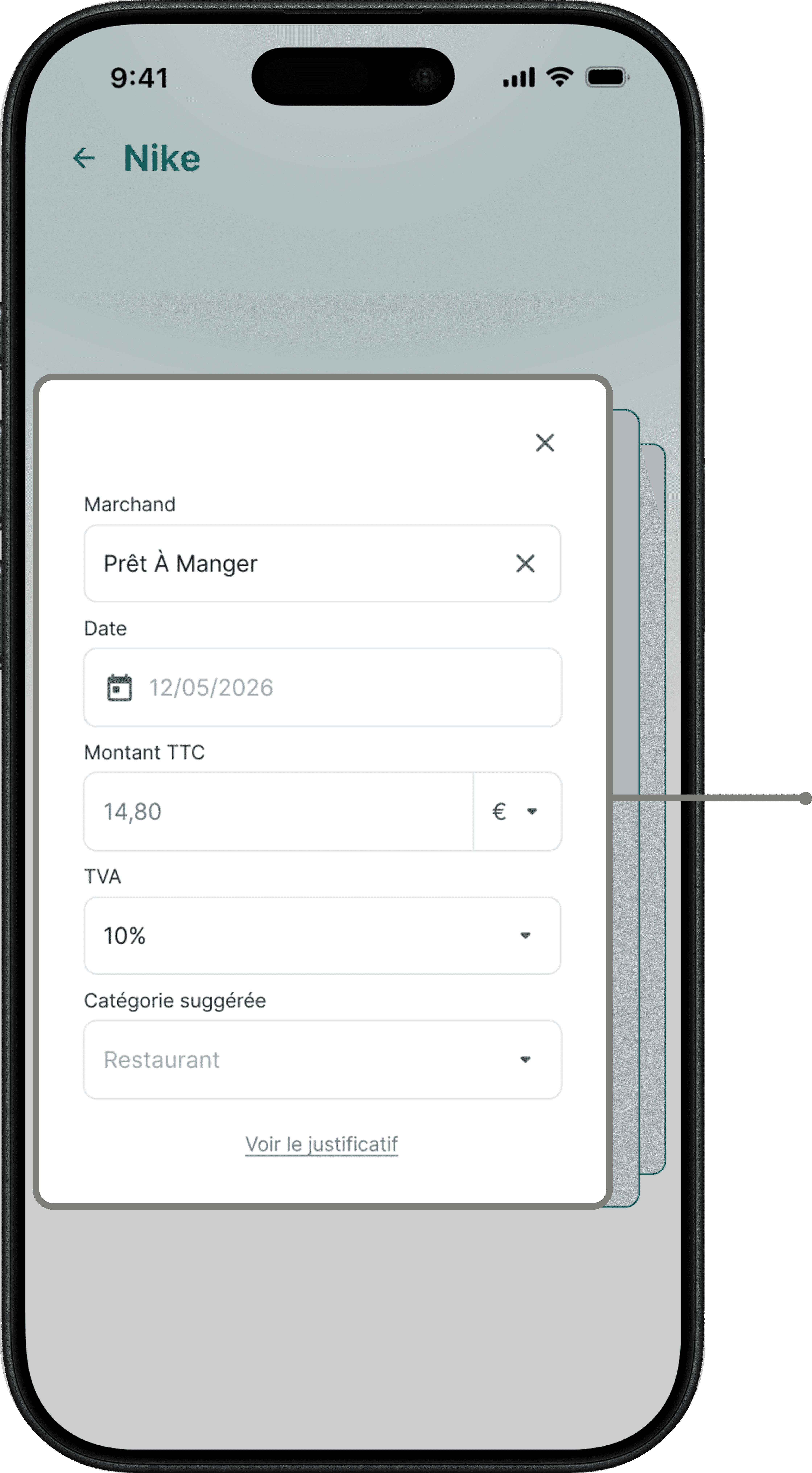
Let the system extract and pre-fill information, so users only review what requires their attention.
DESIGN RESPONSE #3
Reduce repetitive work
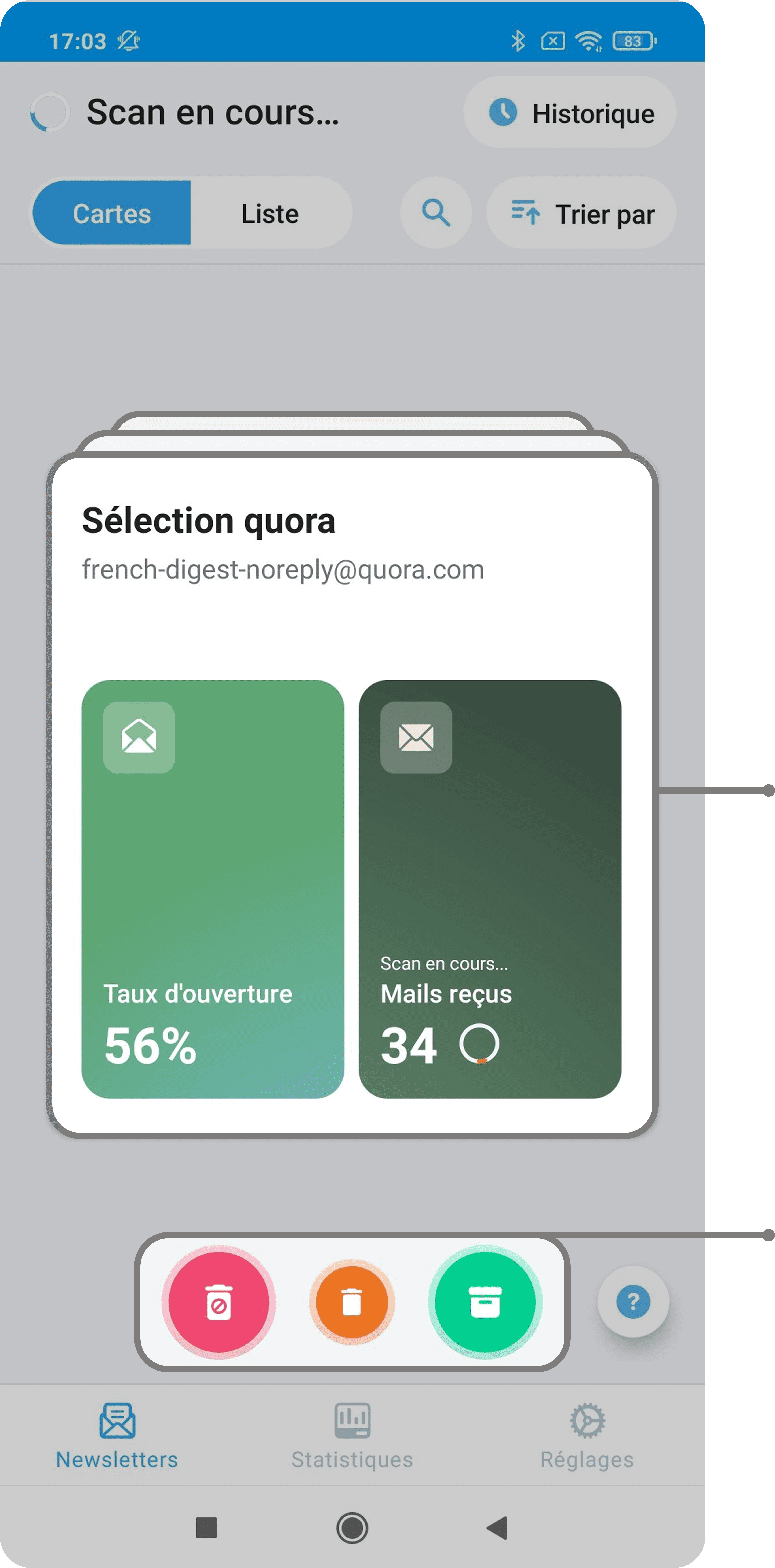
Reduce repetitive actions by enabling batch capture and submission.


05 ———— User testing
User testing
We tested our first concept with four participants to understand:
🟢 what reduced cognitive load
🟠 what still created friction




06 ———— V2
Iterating the experience


08 ———— Final experience
Final prototype
09 ———— Success metrics
KPIs
As the concept wasn't shipped, these metrics define how I would evaluate whether the experience actually reduces the burden of expense reporting.
10 ———— Going further
Next opportunities
The employee experience is only one part of the reimbursement journey. I identified three opportunities to further reduce manual work and extend the experience across the wider workflow.
🔄
Design the other side of the workflow
Explore manager and Finance workflows to improve approvals, exception handling and communication.
📅
Connect expenses to work context
Use calendar and business-trip context to suggest projects and clients automatically.
🔔
Make required actions proactive
Extend in-app alerts to contextual push notifications when an expense requires attention.
Reflection
AUTOMATION ISN'T ENOUGH
Reducing cognitive load wasn't only about automating tasks. It also meant reducing decisions and directing attention to what actually required user input.
VISIBILITY NEEDS STRUCTURE
Making more information visible doesn't necessarily make a process clearer. Hierarchy and progressive disclosure became essential as the experience grew.
DESIGN BEYOND THE HAPPY PATH
Designing for errors, uncertainty and required actions proved as important as designing the ideal submission flow.

