View my work
About me
Helping users discover AI features through contextual missions

A lightweight mission system that transforms everyday conversations into opportunities to discover and adopt advanced AI features.
Role
Product Designer · Team of 3
Scope
Research · Product Strategy · Prototyping · User Testing
Duration
2-week sprint
Category
Marketplace · Mobile
About the project
At the time of this project, Mistral AI's assistant was still called Le Chat. It has since been renamed Vibe.
This case study explores how lightweight gamification can support product adoption by helping users discover valuable AI capabilities without disrupting the core chat experience.
The brief provided one key retention signal, one requested lever, and two product objectives.
⏳
1/30
users still return daily after one month
🎮
Gamification
requested lever for engagement
📈
D30 retention
increase return rate after 30 days
📲
DAU
increase active users
The project was completed during The Design Crew bootcamp from a brief focused on Le Chat's engagement and retention.
While the initial concept was developed collaboratively during the sprint, I continued the project independently, creating a personal V3 informed by user testing insights.
INITIAL SPRINT BRIEF
How might we gamify Le Chat to increase engagement and retention?
01 ———— Problem framing
Framing the opportunity
Before exploring solutions, we broke the challenge down into its different dimensions to understand where gamification could create value and where it could become distracting.
This exploration highlighted the questions our benchmark needed to answer before we could define a solution.
🎯
AI use cases
Summarise · Prompt
Generate · Search
🧩
Gamification mechanics
Missions · XP · Rewards
Levels · Streaks · Avatars
🔁
Habit-building
Meaningful reasons
to come back
⚠️
Experience risks
No chat interruptions
No artificial game layers


02 ———— Benchmark
Learning from gamification patterns
We benchmarked products where gamification reinforces the core experience rather than distracting from it. We grouped the references into two complementary approaches.
👾
Integrated gamification
Built into the core experience
✨
Added gamification
Supports the main use as a light layer
This distinction helped us decide whether gamification should become part of the core experience or remain a lightweight supporting layer.
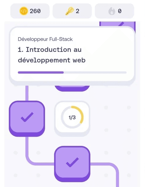
Native patterns we kept
Duolingo and Mimo showed how visible progress and guided missions can make complex learning easier to understand and complete.

BENCHMARK #1
INSIGHT #1
Duolingo
visible progress
use signals
Streaks and levels make progress easy to track.
use signals
DESIGN DECISION
WHAT WE LIKED
Visualise feature discovery through progression.


BENCHMARK #2
INSIGHT #1
Mimo
guided missions
use signals
Missions and paths turn complex learning into clear next steps.
use signals
DESIGN DECISION
WHAT WE LIKED
Guide feature discovery through contextual missions.


BENCHMARK #1
INSIGHT #1
Duolingo
visible progress
use signals
Streaks and levels make progress easy to track.
use signals
DESIGN DECISION
WHAT WE LIKED
Visualise feature discovery through progression.


BENCHMARK #2
INSIGHT #1
Mimo
guided missions
use signals
Missions and paths turn complex learning into clear next steps.
use signals
DESIGN DECISION
WHAT WE LIKED
Guide feature discovery through contextual missions.


Added patterns we prioritised
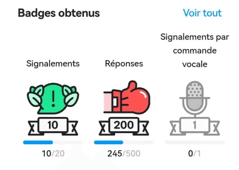
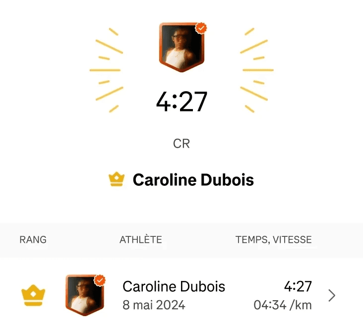
Waze and Strava showed how lightweight gamification can reinforce useful behaviours without taking over the core experience.
BENCHMARK #3

INSIGHT #1
Waze
subtle gamification layer
use signals
Waze stays GPS-first, while useful reports unlock points, badges and levels.
use signals
DESIGN DECISION
WHAT WE LIKED
Reward useful actions without interrupting conversations.


BENCHMARK #3

INSIGHT #1
Waze
subtle gamification layer
use signals
Waze stays GPS-first, while useful reports unlock points, badges and levels.
use signals
DESIGN DECISION
WHAT WE LIKED
Reward useful actions without interrupting conversations.


BENCHMARK #4
INSIGHT #1
Strava
activity-based rewards
use signals
Strava rewards real activity with badges, challenges and progress stats.
use signals
DESIGN DECISION
WHAT WE LIKED
Reward meaningful AI interactions over artificial tasks.

What we learned
These benchmarks converged around three principles that shaped the first concept.
⭐️
Support the core use case
Reinforce the core experience, not compete with it.
💪
Reward useful behaviours
Reward behaviours that create product value.
📈
Make progress visible
Help users understand what they've explored and unlocked.
Key design constraint
Gamification should guide users toward useful AI behaviours, without distracting from the core chat experience.
What we learned
These benchmarks converged around three principles that shaped the first concept.
⭐️
Support the core use case
Reinforce the core experience, not compete with it.
💪
Reward useful behaviours
Reward behaviours that create product value.
product value.
📈
Make progress visible
Help users understand what they've explored and unlocked.
Key design constraint
Gamification should guide users toward useful AI behaviours, without distracting from the core chat experience.
03 ———— Design directions
From reminders to contextual missions
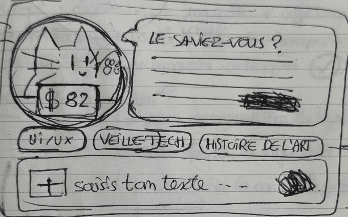
Early ideas focused on bringing users back through reminders, widgets and shortcuts.
However, these concepts lived outside the core chat experience. They increased visibility, but did little to support product discovery.
We shifted toward contextual missions embedded in real conversations, allowing product discovery to happen naturally within the chat experience.
Widgets and reminders

Early direction
Mission hub

Concept evolution
Missions inside Le Chat

Final direction
Widgets and reminders

Early direction
Mission hub

Concept evolution
Missions inside Le Chat

Final direction
Pattern exploration
These patterns shaped the first version of our product concepts.
Personal V3 exploration
User testing validated the overall direction while revealing several usability issues.
Our team addressed the main findings through a V2 iteration during the sprint
. After the sprint ended, I continued exploring the concept independently, developing a personal V3 focused on discoverability, guided learning and product-value rewards.
04 ———— Concept & V1
A mission-based discovery system
Guided by our benchmark insights, we designed a first concept built around a simple progression loop. Completing missions rewards useful behaviours, makes progress visible and gradually unlocks new rewards.
Missions

Guide users toward valuable AI behaviours.
XP

Reward meaningful actions.
Progression

Make exploration visible.
Rewards

Encourage continued exploration.
Missions

Guide users toward valuable AI behaviours.
XP

Reward meaningful actions.
Progression

Make exploration visible.
Rewards

Encourage continued exploration.
Concept
Rather than adding game mechanics for their own sake, we focused on reinforcing meaningful product usage through visible progression and lightweight rewards.


How missions work
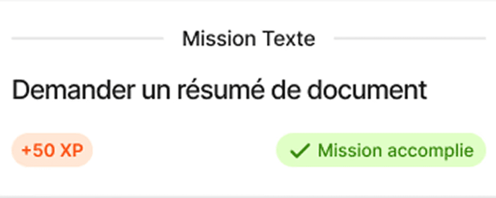
Missions could be launched from the mission hub or triggered contextually after relevant user actions, turning everyday usage into learning opportunities.
The first prototype focused on familiar AI use cases, prompt improvement and guided product exploration.
Document summary

A familiar use case that helps users quickly understand Le Chat’s value.
Better prompting

An AI best practice that improves the quality of real conversations.
Try or create an agent

An advanced feature introduced through guided exploration.
Document summary

A familiar use case that helps users quickly understand Le Chat’s value.
Better prompting

An AI best practice that improves the quality of real conversations.
Try or create an agent

An advanced feature introduced through guided exploration.
Visual language
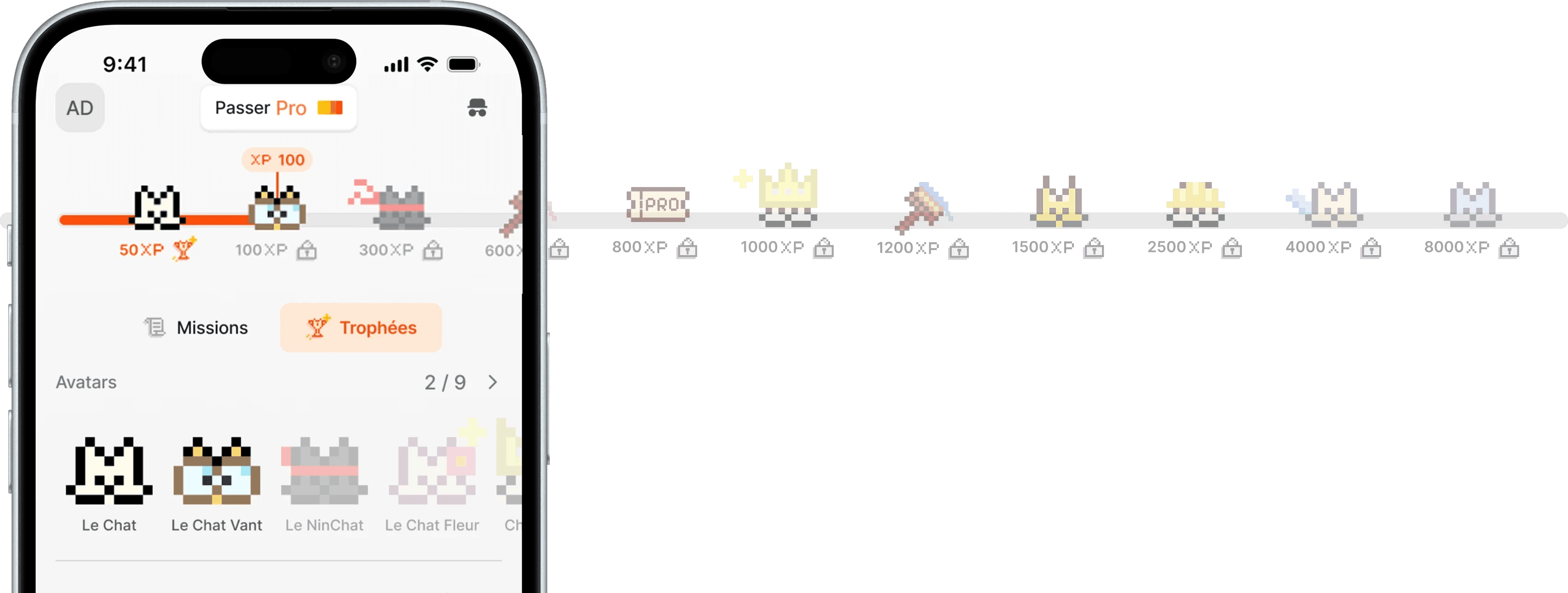
To stay consistent with Le Chat's visual identity, the reward system reuses its existing pixel-art language while introducing new assets for progression, missions and rewards.
Created pixel-art assets


Pixel-art existing illustrations


Created pixel-art assets


Pixel-art existing illustrations


V1

Turning usage into learning
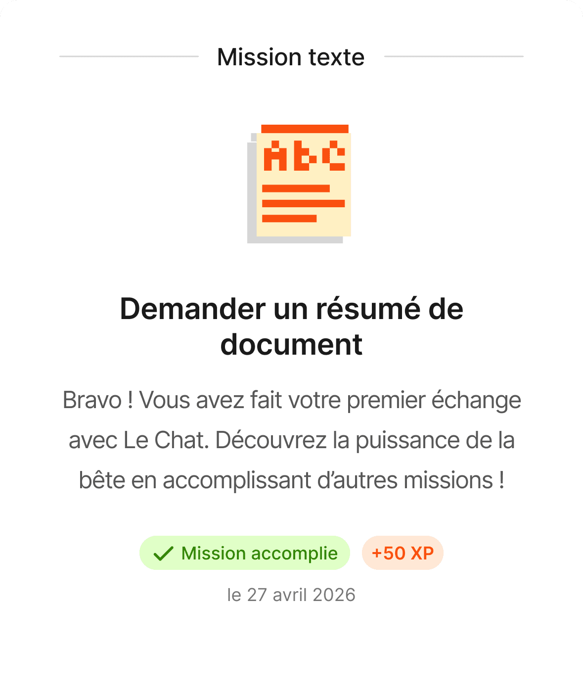
The prototype demonstrates how contextual missions integrate naturally into conversations, rewarding meaningful behaviours, making progress visible and encouraging continued exploration.
My contribution
This concept was developed by a team of three. I focused on the following areas:
⚙️
⚙️
Interaction design
Interaction design
Designed the mission system, reward experience and V3 flows.
🎨
🎨
Visual design
Visual design
Created mission icons,reward copywriting and pixel-art avatars.
🔍
🔍
UX research
UX research
Created the interview guide and synthesized key insights.
🎯
🎯
Product strategy
Product strategy
Defined the gamification strategy, aligning retention and product adoption.
⚙️
Interaction design
Designed the mission system, reward experience and V3 flows.
🎨
Visual design
Created mission icons,reward copywriting and pixel-art avatars.
🔍
UX research
Created the interview guide and synthesized key insights.
🎯
Product strategy
Defined the gamification strategy, aligning retention and product adoption.
05 ———— Tests
Validating the first concept
We wanted to understand whether users noticed missions, understood the progression system and perceived value in the experience.
We tested the first prototype with five participants through remote semi-structured interviews.
Our panel

Nihel, 31
Professional use

Ilan, 30
Professional use

Simon, 27
Regular user

Ben, 36
Regular user

Anne, 41
Occasional user
Our panel


Anne, 41
Occasional user


Ben, 36
Regular user
What we wanted to validate
☐ System comprehension
Do users understand missions, XP and rewards?
☐ Discoverability
Do users notice and interact with missions?
☐ Perceived value
Do missions make users want to explore more?
🎙️
45-min semi-structured interviews
Natural flow then retrospective questions
Remote video calls


Nihel, 31
Professional use


Ilan, 30
Professional use


Simon, 27
Regular user
06 ———— Iterations
Insights & Design priorities
Interviews confirmed some of our assumptions while challenging others.
Three consistent patterns emerged:
INSIGHT #1
INSIGHT #1
2/5
understood the system upfront
use signals
→ system too hidden
→ banners mostly ignored
→ focus stayed on chat response
use signals
“It felt a bit like an ad; my brain completely filtered it out.”

Nihel
INSIGHT #2
INSIGHT #1
2/5
interacted with the mission list
use signals
→ task descriptions needed
→ states not scannable
→ difficulty levels missing
use signals
“I’d like to see how it works under the title.”

Ilan
INSIGHT #3
use signals
3/5
wanted more advanced rewards
use signals
→ users wanted deeper missions
→ rewards stronger when useful
→ XP needed clearer affordance
use signals
“I’d like some use-to-win logic, like unlocking Pro capabilities.”

Simon
DESIGN PRIORITY #1
INSIGHT #1
Better discoverability
use signals
Introduce contextual entry points that support the chat experience.
DESIGN PRIORITY #2
INSIGHT #1
Clearer progression
use signals
Make missions, rewards and XP progression easier to understand.
DESIGN PRIORITY #3
INSIGHT #1
Hands-on learning
use signals
Replace passive tutorials with contextual, hands-on exercises.
06 ———— Iterations
INSIGHT #1
INSIGHT #1
2/5
understood the system upfront
use signals
→ system too hidden
→ banners mostly ignored
→ focus stayed on chat responseuse signals
“It felt a bit like an ad; my brain completely filtered it out.”

Nihel
DESIGN PRIORITY #1
INSIGHT #1
Better discoverability
use signals
Introduce contextual entry points that support the chat experience.
INSIGHT #2
INSIGHT #1
2/5
interacted with the mission list
use signals
→ task descriptions needed
→ states not scannable
→ difficulty levels missinguse signals
“I’d like to see how it works under the title.”

Ilan
DESIGN PRIORITY #2
INSIGHT #1
Clearer progression
use signals
Make missions, rewards and XP progression easier to understand.
INSIGHT #3
use signals
3/5
wanted more advanced rewards
use signals
→ users wanted deeper missions
→ rewards stronger when useful
→ XP needed clearer affordanceuse signals
“I’d like some use-to-win logic, like unlocking Pro capabilities.”

Simon
DESIGN PRIORITY #3
INSIGHT #1
Hands-on learning
use signals
Replace passive tutorials with contextual, hands-on exercises.
Insights & Design priorities
Interviews confirmed some of our assumptions while challenging others.
Three consistent patterns emerged:
INSIGHT #1
INSIGHT #1
2/5
understood the system upfront
use signals
→ system too hidden
→ banners mostly ignored
→ focus stayed on chat response
use signals
“It felt a bit like an ad; my brain completely filtered it out.”

Nihel
DESIGN PRIORITY #1
INSIGHT #1
Better discoverability
use signals
Introduce contextual entry points that support the chat experience.
INSIGHT #2
INSIGHT #1
2/5
interacted with the mission list
use signals
→ task descriptions needed
→ states not scannable
→ difficulty levels missing
use signals
“I’d like to see how it works under the title.”

Ilan
DESIGN PRIORITY #2
INSIGHT #1
Clearer progression
use signals
Make missions, rewards and XP progression easier to understand.
INSIGHT #3
use signals
3/5
wanted more advanced rewards
use signals
→ users wanted deeper missions
→ rewards stronger when useful
→ XP needed clearer affordance
use signals
“I’d like some use-to-win logic, like unlocking Pro capabilities.”

Simon
DESIGN PRIORITY #3
INSIGHT #1
Hands-on learning
use signals
Replace passive tutorials with contextual, hands-on exercises.
Personal V3 exploration
User testing validated the overall direction while revealing several usability issues.
Our team addressed the main findings through a V2 iteration during the sprint. After the sprint ended, I continued exploring the concept independently, developing a personal V3 focused on discoverability, guided learning and product-value rewards.
PERSONAL REFINEMENT #1
Better discoverability
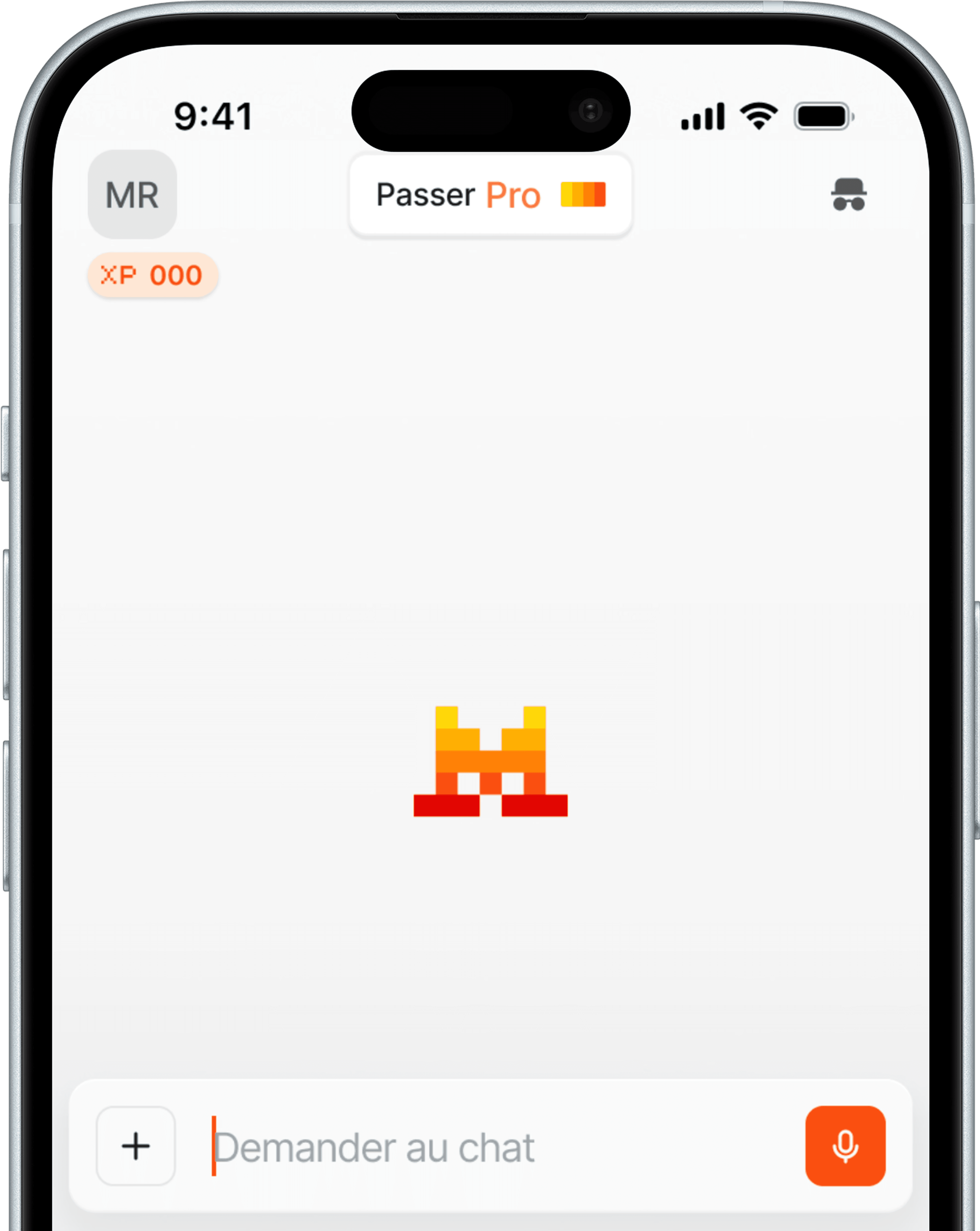
User testing revealed that missions were too hidden within the natural chat flow.
I redesigned their entry points to introduce them contextually without interrupting the conversation.
V1 : initial concept
Missions remained hidden

V3 : personal iteration
Contextual invitation & clear CTA

3
3
V1 : initial concept
Missions remained hidden

V3 : personal iteration
Contextual invitation & clear CTA

3
3
PERSONAL REFINEMENT #2
Clearer missions
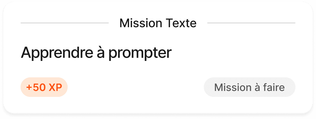
Users struggled to understand what each mission involved before starting.
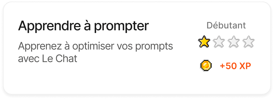
I redesigned mission cards with clearer descriptions, difficulty indicators and stronger visual hierarchy.
V1: initial concept

Minimal mission context
V2: team iteration

Added mission description and difficulty
V3: personal exploration

Clear mission preview and simplified hierarchy
PERSONAL REFINEMENT #3
A more coherent mission hub
Browsing missions felt fragmented and progression was difficult to understand.
I simplified the mission hub while surfacing product-value rewards earlier to encourage exploration of advanced features.
V2 : team iteration

V3 : personal exploration

V2 : team iteration

V3 : personal exploration

PERSONAL REFINEMENT #4
Guided practice
The original prompting mission relied on passive tutorials rather than real practice.
I replaced it with a guided exercise built around one of the user's own prompts, turning a real conversation into a contextual learning experience.
V2 : team iterations
Tutorial

V3 : personal iteration
Guided prompt refinement

automatically reuses the previous prompt
V3 : personal iteration
Guided prompt refinement

why it works
improved prompt
V2 : team iterations
Tutorial

V3 : personal iteration
Guided prompt refinement

automatically reuses the previous prompt

why it works
improved prompt
PERSONAL REFINEMENT #5
Product-value rewards
In V2, product-value rewards existed only as illustrative concepts.
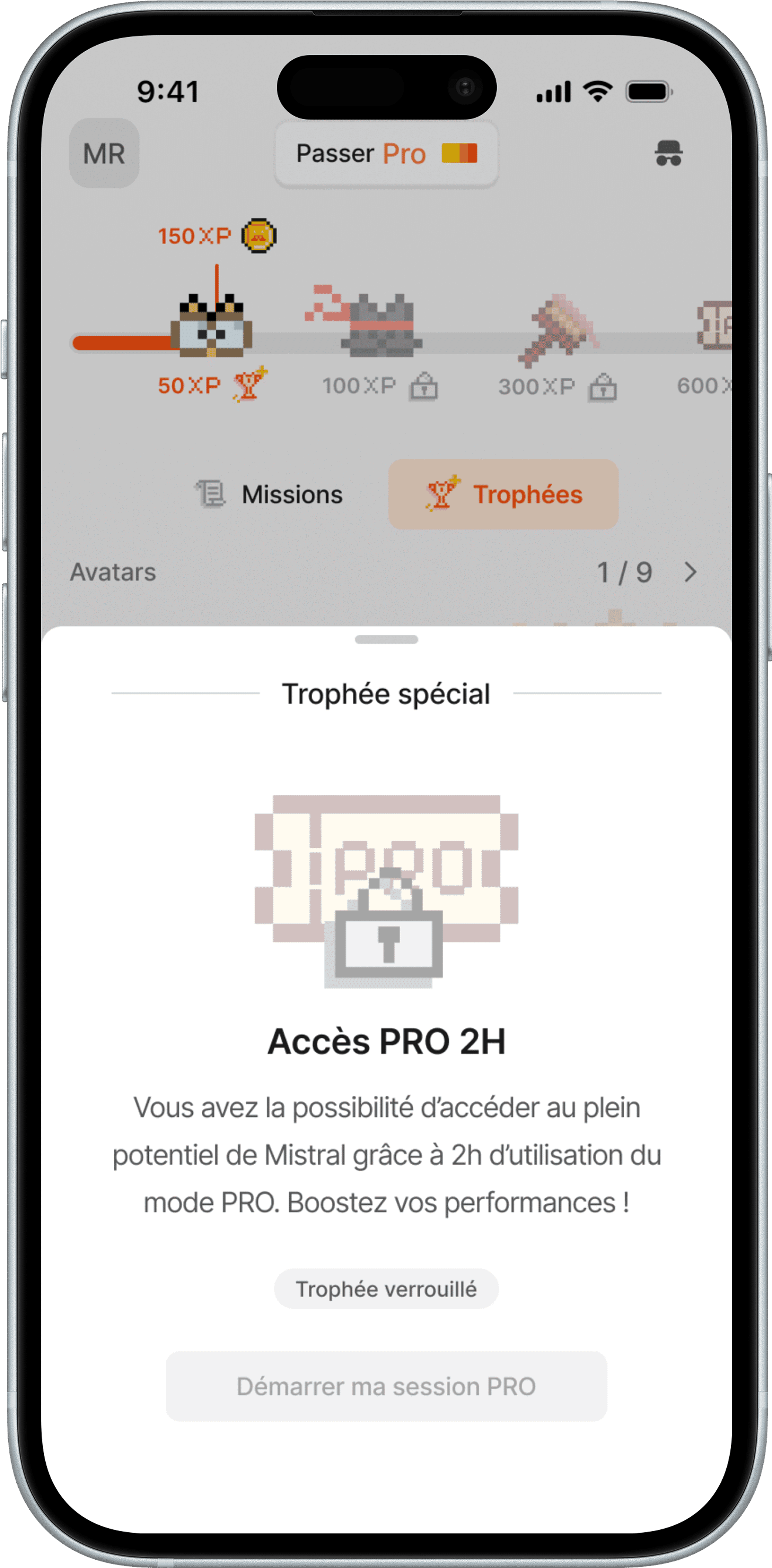
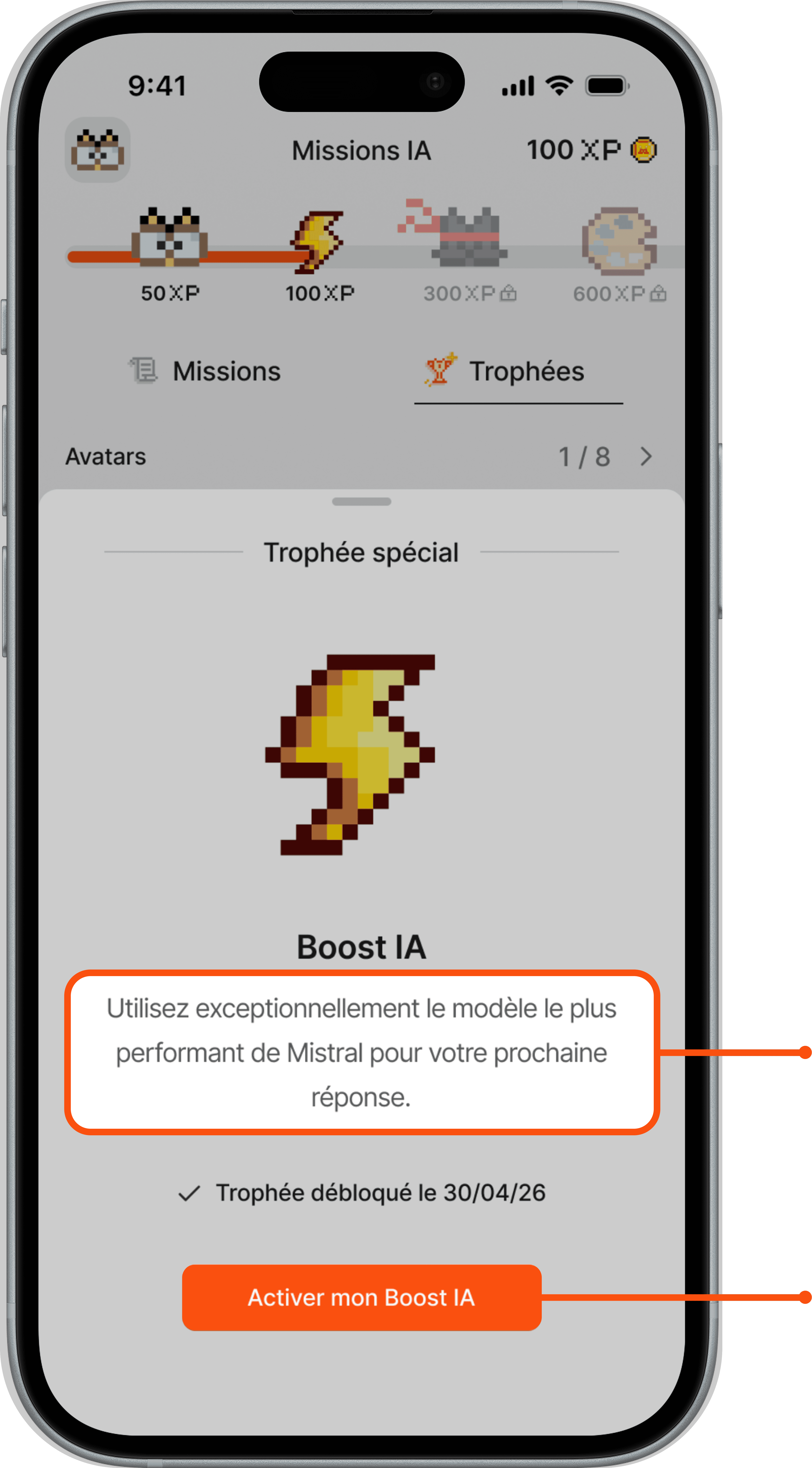
In my V3 exploration, I designed how they unlock, communicate their value and integrate naturally into the user journey.
V2 : team iterations

V2 : team iterations

*Reward values are exploratory and require validation against business and technical constraints.
V2 : team iterations

V3 : personal iteration*
dedicated activation

clear value proposition
V3 : personal iteration*

immediate confirmation
03 ———— Design directions
From reminders to contextual missions
Early ideas focused on bringing users back through reminders, widgets and shortcuts.
However, these concepts lived outside the core chat experience. They increased visibility, but did little to support product discovery.
We shifted toward contextual missions embedded in real conversations, allowing product discovery to happen naturally within the chat experience.
Widgets and reminders

Early direction
Mission hub

Concept evolution
Missions inside Le Chat

Final direction
These patterns shaped the first version of our product concepts.
04 ———— Concept & V1
A mission-based discovery system
Guided by our benchmark insights, we designed a first concept built around a simple progression loop. Completing missions rewards useful behaviours, makes progress visible and gradually unlocks new rewards.
Missions

Guide users toward valuable AI behaviours.
XP


Reward meaningful actions.
Progression

Make exploration visible.
Rewards

Encourage continued exploration.
Concept
Rather than adding game mechanics for their own sake, we focused on reinforcing meaningful product usage through visible progression and lightweight rewards.


How missions work
Missions could be launched from the mission hub or triggered contextually after relevant user actions, turning everyday usage into learning opportunities.
The first prototype focused on familiar AI use cases, prompt improvement and guided product exploration.
Document summary

A familiar use case that helps users quickly understand Le Chat’s value.
Better prompting

An AI best practice that improves the quality of real conversations.
Try or create an agent

An advanced feature introduced through guided exploration.
Visual language
To stay consistent with Le Chat's visual identity, the reward system reuses its existing pixel-art language while introducing new assets for progression, missions and rewards.

Created pixel-art assets


Pixel-art existing illustrations


V1

Turning usage into learning
The prototype demonstrates how contextual missions integrate naturally into conversations, rewarding meaningful behaviours, making progress visible and encouraging continued exploration.
My contribution
This concept was developed by a team of three. I focused on the following areas:
⚙️
Interaction design
Designed the mission system, reward experience and V3 flows.
🎨
Visual design
Created mission icons,reward copywriting and pixel-art avatars.
🔍
UX research
Created the interview guide and synthesized key insights.
🎯
Product strategy
Defined the gamification strategy, aligning retention and product adoption.
05 ———— Tests
Validating the first concept
We wanted to understand whether users noticed missions, understood the progression system and perceived value in the experience.
We tested the first prototype with five participants through remote semi-structured interviews.


Nihel, 31
Professional use


Ilan, 30
Professional use


Simon, 27
Regular user


Ben, 36
Regular user


Anne, 41
Occasional user
What we wanted to validate
☐ System comprehension
Do users understand missions, XP and rewards?
☐ Discoverability
Do users notice and interact with missions?
☐ Perceived value
Do missions make users want to explore more?
🎙️
45-min semi-structured interviews
Natural flow then retrospective questions
Remote video calls
06 ———— Iterations
Insights & Design priorities
Interviews confirmed some of our assumptions while challenging others.
Three consistent patterns emerged:
INSIGHT #1
INSIGHT #1
2/5
understood the system upfront
use signals
→ system too hidden
→ banners mostly ignored
→ focus stayed on chat response
use signals
“It felt a bit like an ad; my brain completely filtered it out.”


Nihel
INSIGHT #2
INSIGHT #1
2/5
interacted with the mission list
use signals
→ task descriptions needed
→ states not scannable
→ difficulty levels missing
use signals
“I’d like to see how it works under the title.”


Ilan
INSIGHT #3
use signals
3/5
wanted more advanced rewards
use signals
→ users wanted deeper missions
→ rewards stronger when useful
→ XP needed clearer affordance
use signals
“I’d like some use-to-win logic, like unlocking Pro capabilities.”


Simon
DESIGN PRIORITY #1
INSIGHT #1
Better discoverability
use signals
Introduce contextual entry points that support the chat experience.
DESIGN PRIORITY #2
INSIGHT #1
Clearer progression
use signals
Make missions, rewards and XP progression easier to understand.
DESIGN PRIORITY #3
INSIGHT #1
Hands-on learning
use signals
Replace passive tutorials with contextual, hands-on exercises.
PERSONAL REFINEMENT #1
Better discoverability
User testing revealed that missions were too hidden within the natural chat flow.
I redesigned their entry points to introduce them contextually without interrupting the conversation.
V1 : initial concept
Missions remained hidden

V3 : personal iteration
Contextual invitation & clear CTA

3
3
PERSONAL REFINEMENT #2
Clearer missions
Users struggled to understand what each mission involved before starting.
I redesigned mission cards with clearer descriptions, difficulty indicators and stronger visual hierarchy.
V1: initial concept

Minimal mission context
V2: team iteration

Added mission description and difficulty
V3: personal exploration

Clear mission preview and simplified hierarchy
PERSONAL REFINEMENT #3
A more coherent mission hub
Browsing missions felt fragmented and progression was difficult to understand.
I simplified the mission hub while surfacing product-value rewards earlier to encourage exploration of advanced features.
V2 : team iteration

V3 : personal exploration

PERSONAL REFINEMENT #4
Guided practice
The original prompting mission relied on passive tutorials rather than real practice.
I replaced it with a guided exercise built around one of the user's own prompts, turning a real conversation into a contextual learning experience.
V2 : team iterations
Tutorial

V3 : personal iteration
Guided prompt refinement

automatically reuses the previous prompt

why it works
improved prompt
PERSONAL REFINEMENT #5
Product-value rewards
In V2, product-value rewards existed only as illustrative concepts.
In my V3 exploration, I designed how they unlock, communicate their value and integrate naturally into the user journey.
V2 : team iterations

V3 : personal iteration*
dedicated activation

clear value proposition

immediate confirmation
*Reward values are exploratory and require validation against business and technical constraints.
dedicated activation

clear value proposition

immediate confirmation
V3 : personal iteration*
08 ———— Final experience
Final prototype
The final prototype demonstrates how the different V3 improvements come together into one cohesive experience.
09 ———— Success metrics
KPIs
As the concept wasn't shipped, these metrics define how I would evaluate whether the experience actually reduces the burden of expense reporting.

↑ ADVANCED FEATURE ADOPTION
% of users who try and continue using capabilities discovered through missions (e.g. AI agents, premium models and Pro features).
↑ PRO CONVERSION AFTER REWARD TRIAL
% of users who upgrade to Pro after experiencing a premium capability through a product-value reward, compared with users who did not receive a trial.
↑ 30-DAY RETENTION
% of mission users who remain active 30 days later, compared with users who don't engage with missions.
↑ DAILY ACTIVE USAGE
Change in active usage frequency among users who engage with missions, compared with non-mission users.
KPIs
As the concept wasn't shipped, these metrics define how I would evaluate whether the experience actually reduces the burden of expense reporting.
↑ ADVANCED FEATURE ADOPTION
% of users who try and continue using capabilities discovered through missions (e.g. AI agents, premium models and Pro features).
↑ PRO CONVERSION AFTER REWARD TRIAL
% of users who upgrade to Pro after experiencing a premium capability through a product-value reward, compared with users who did not receive a trial.
↑ 30-DAY RETENTION
% of mission users who remain active 30 days later, compared with users who don't engage with missions.
↑ DAILY ACTIVE USAGE
Change in active usage frequency among users who engage with missions, compared with non-mission users.
10 ———— Going further
Next opportunities
Beyond the sprint, I identified three opportunities to extend the concept:
🧠
Model & discovery missions
Use contextual missions to introduce new Mistral models and encourage feature adoption through guided exploration, such as newly-launched OCR 4 or Voxtral.
⌚️
Time-limited missions
Introduce limited-time missions with exclusive rewards to encourage users to return regularly.
😸
AI companion
Turn the pixel companion into a guide that supports users throughout their learning journey (milestones…)
Reflection
Continuing the project after the sprint pushed me to think beyond interface design and explore how onboarding, learning and rewards can work together to support long-term product adoption.
This project reinforced my belief that gamification creates the most value when it supports product discovery rather than competing for users' attention.