View my work

About me

Reducing cognitive load in expense reporting

Reducing cognitive load in expense reporting

What began as a request to simplify expense reporting evolved into a research-driven effort to reduce cognitive load across the reimbursement journey.

What began as a request to simplify expense reporting evolved into a research-driven effort to reduce cognitive load across the reimbursement journey.

Role

Product Designer · Team of 3

End-to-end product design

Duration

2-week sprint

About the project

Expense reporting was one of the most requested workflows among Pennylane's Premium customers, making it a key opportunity to improve both employee experience and operational efficiency.

The initial brief focused on simplifying the journey from payment to reimbursement. However, early research challenged our assumptions and uncovered a more fundamental problem.

Before conducting research, we reviewed the existing product context shared by Pennylane:

21 days

Average reimbursement delay

✈️

100%

Expenses happen on the go

🧾

30%

Need Finance revisions

#1 request

Premium customer request

This project was completed as part of The Design Crew bootcamp. The challenge was introduced by a Product Designer at Pennylane and based on a real product opportunity the company wanted to explore:

INITIAL SPRINT BRIEF

How might we simplify the expense reporting journey from payment to reimbursement?

01 ———— Discovery

Understanding the problem

Before exploring solutions, we wanted to understand how expense reporting actually worked, where friction occurred, and whether simplifying the interface would solve the real problem.

To build this understanding, we combined competitive analysis, workflow mapping and user research.

🔍

Competitive analysis

Compared leading expense management products, public reviews and feature sets.

🗺️

Workflow mapping

Reconstructed the end-to-end reporting process before challenging it.

🎙️

User interviews

Observed how employees actually capture, submit and track expenses.

Comptetitive analysis

Competitive analysis

We benchmarked more than ten expense management products to understand common workflows, automation patterns and recurring usability issues across the market.

🎯

Common patterns

Automatic receipt capture

🧩

Recurring pain points

Manual categorisation

🔁

Design opportunities

Better visibility during reimbursement

Workflow mapping

Before redesigning the experience, we mapped the existing reporting journey to understand every decision users had to make, from capturing a receipt to receiving reimbursement.

The mapping revealed multiple context switches, approval stages and manual decisions throughout the journey.

Workflow mapping

User research

To validate our assumptions, we interviewed five employees with different roles and expense reporting habits. We focused on understanding their workflow, expectations and the biggest sources of friction.

PARTICIPANTS

INSIGHT #1

5 Employees

across sales, finance, product and leadership roles

use signals

Expense reporting frequency

●●●●○ Frequent users

●○○○○ Occasional users

use ●○○○○ Occasional users

Research goals

☐ Workflow understanding

Do users understand the reimbursement process?

☐ Status visibility

Do users understand what happens after submission?

☐ Automation expectations

What do users expect the system to do for them?

☐ Administrative burden

Which tasks create the most friction?

What we learned

Interviews confirmed some of our assumptions while challenging others.

Three consistent patterns emerged:

INSIGHT #1

INSIGHT #1

use signals

use signals

0/5

0/5

understand the full process

understand the full process

use signals

use signals

→ don't know reimbursement limits
→ don't understand approval stages
→ don't know when they'll be reimbursed

→ don't know reimbursement limits
→ don't understand approval stages
→ don't know when they'll be reimbursed

use signals

use signals

"I have no idea what happens after I submit an expense."

"I have no idea what happens after I submit an expense."

Simon

Simon

INSIGHT #2

INSIGHT #2

INSIGHT #1

INSIGHT #1

5/5

5/5

administrative work feels like a burden

administrative work feels like a burden

use signals

use signals

→ reporting feels like a chore
→ skip low-value reimbursements
→ delay expense reporting

→ reporting feels like a chore
→ skip low-value reimbursements
→ delay expense reporting

use signals

use signals

Sometimes it's so much hassle that I don't even bother submitting my expenses."

Sometimes it's so much hassle that I don't even bother submitting my expenses."

Ilan

Ilan

INSIGHT #3

INSIGHT #3

INSIGHT #1

INSIGHT #1

5/5

5/5

are frustrated by repetitive admin tasks

are frustrated by repetitive admin tasks

use signals

use signals

→ repeated photo capture
→ repeated form filling
→ repeated categorisation

→ repeated photo capture
→ repeated form filling
→ repeated categorisation

use signals

use signals

"I don't want to do the accountant's job."

"I don't want to do the accountant's job."

Ben

Ben

DESIGN GOAL #1

DESIGN GOAL #1

INSIGHT #1

INSIGHT #1

Make reimbursement predictable

Make reimbursement predictable

use signals

use signals

✓ Make reimbursement rules visible early
✓ Make roles and next steps explicit
✓ Reduce uncertainty

✓ Make reimbursement rules visible early
✓ Make roles and next steps explicit
✓ Reduce uncertainty

DESIGN GOAL #2

DESIGN GOAL #2

INSIGHT #1

INSIGHT #1

Minimise administrative effort

Minimise administrative effort

use signals

use signals

✓ Reduce mental effort
✓ Fit users' natural workflow
✓ Postpone optional tasks

✓ Reduce mental effort
✓ Fit users' natural workflow
✓ Postpone optional tasks

DESIGN GOAL #3

DESIGN GOAL #3

INSIGHT #1

INSIGHT #1

Reduce repetitive work

Reduce repetitive work

use signals

use signals

✓ Eliminate repetitive actions
✓ Reduce repeated inputs
✓ Reduce repeated decisions

✓ Eliminate repetitive actions
✓ Reduce repeated inputs
✓ Reduce repeated decisions

02 ———— Reframing

Shift in perpective

The challenge wasn't simplifying the workflow. It was reducing the mental effort required to complete it.

This reframing became the foundation for every design decision that followed.

INITIAL SPRINT BRIEF

How might we simplify the expense reporting journey from payment to reimbursement?

REFRAMED PROBLEM STATEMENT

How might we reduce employees' cognitive load throughout the expense reporting journey?

How might we reduce employees' cognitive load throughout the expense reporting journey?

REFRAMED PROBLEM STATEMENT

How might we reduce employees' cognitive load throughout the expense reporting journey?

INITIAL SPRINT BRIEF

How might we simplify the expense reporting journey from payment to reimbursement?

03 ———— Ideation

Exploring interaction patterns

We started with divergent ideation to explore multiple concepts without constraints. Once a promising direction emerged, we looked beyond expense management tools to identify familiar interaction patterns that could strengthen the experience.

progress overview

limit indicators

Bankin'

stacked cards

swipe actions

Cleanfox

Bankin'

Jumio

IOS

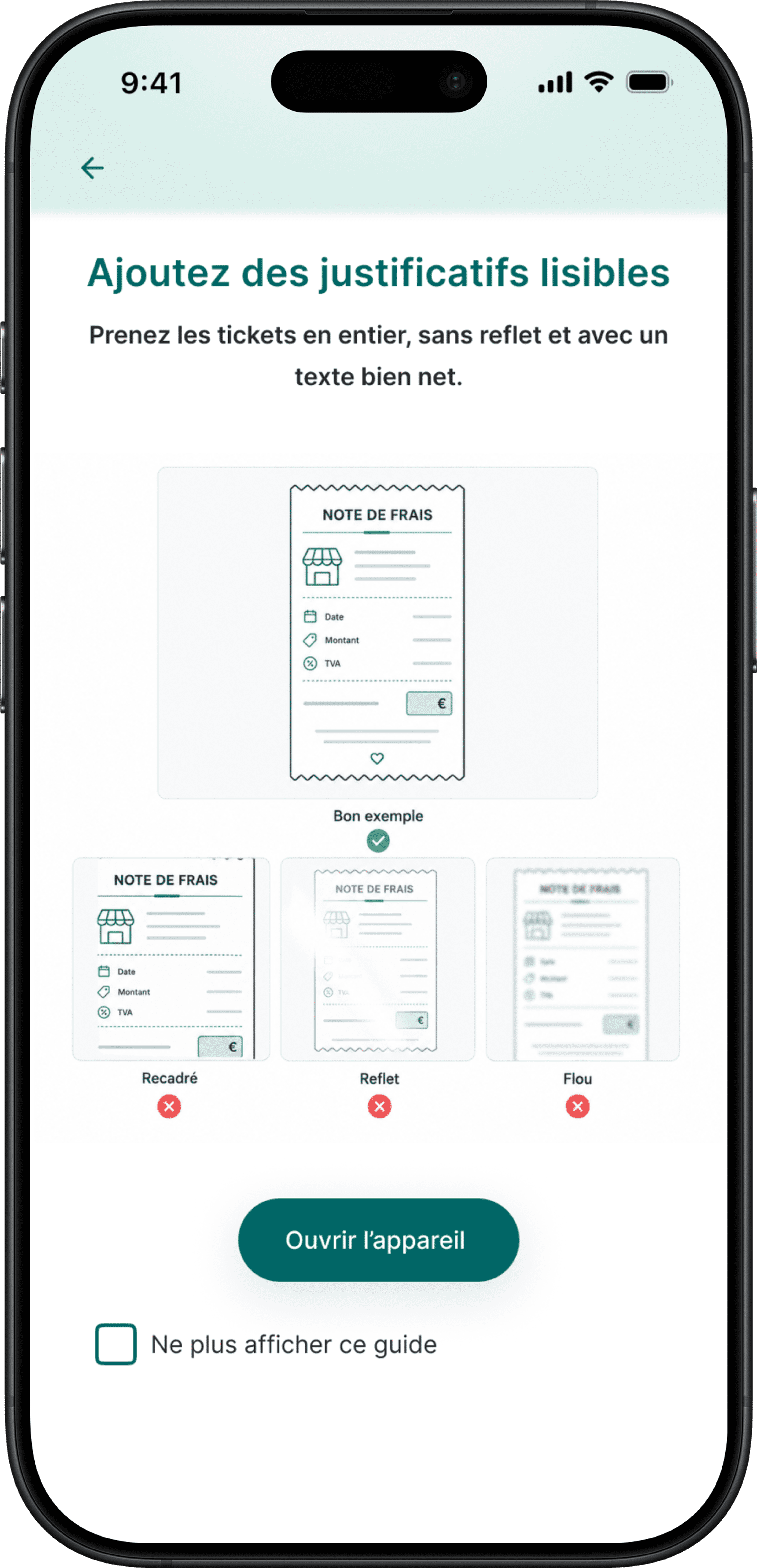
capture guidance

smart autofill

batch capture

status indicators

Camscanner

Airwallex

Pattern exploration

These patterns shaped the first version of our product concepts.

03 ———— Ideation

Exploring interaction patterns

We started with divergent ideation to explore multiple concepts without constraints. Once a promising direction emerged, we looked beyond expense management tools to identify familiar interaction patterns that could strengthen the experience.

progress overview

limit indicators

Bankin'

stacked cards

swipe actions

Cleanfox

progress overview

visual spending limits

Bankin'

stacked cards

swipe actions

Bankin'

Jumio

IOS

capture guidance

smart autofill

batch capture

status indicators

Camscanner

Airwallex

Pattern exploration

These patterns shaped the first version of our product concepts.

04 ———— V1

Designing the first experience

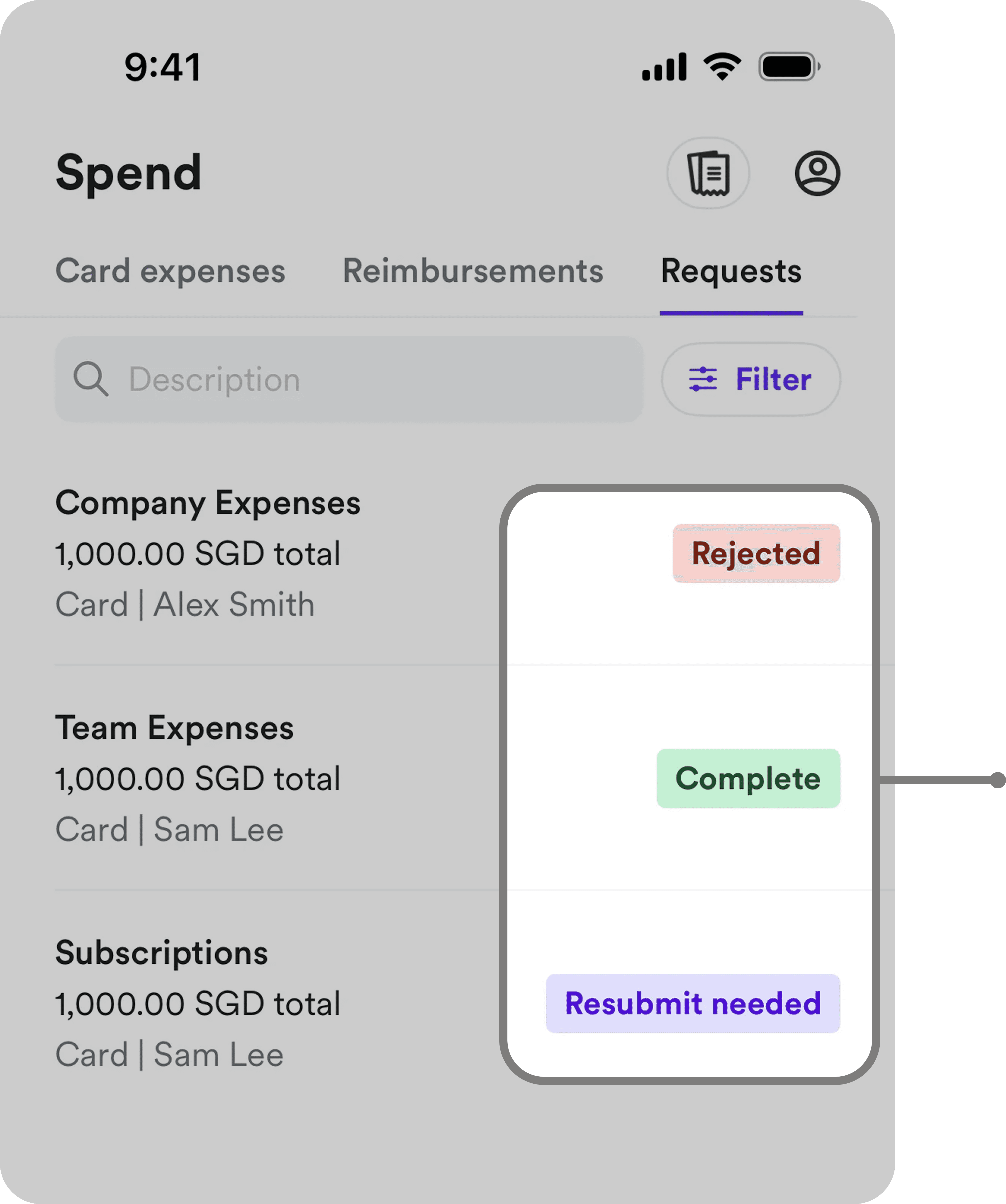
Our first concept translated the design goals into three design responses, each addressing a different source of cognitive load identified during research.

DESIGN RESPONSE #1

Make reimbursement predictable

Make reimbursement rules, progress and next steps visible throughout the journey.
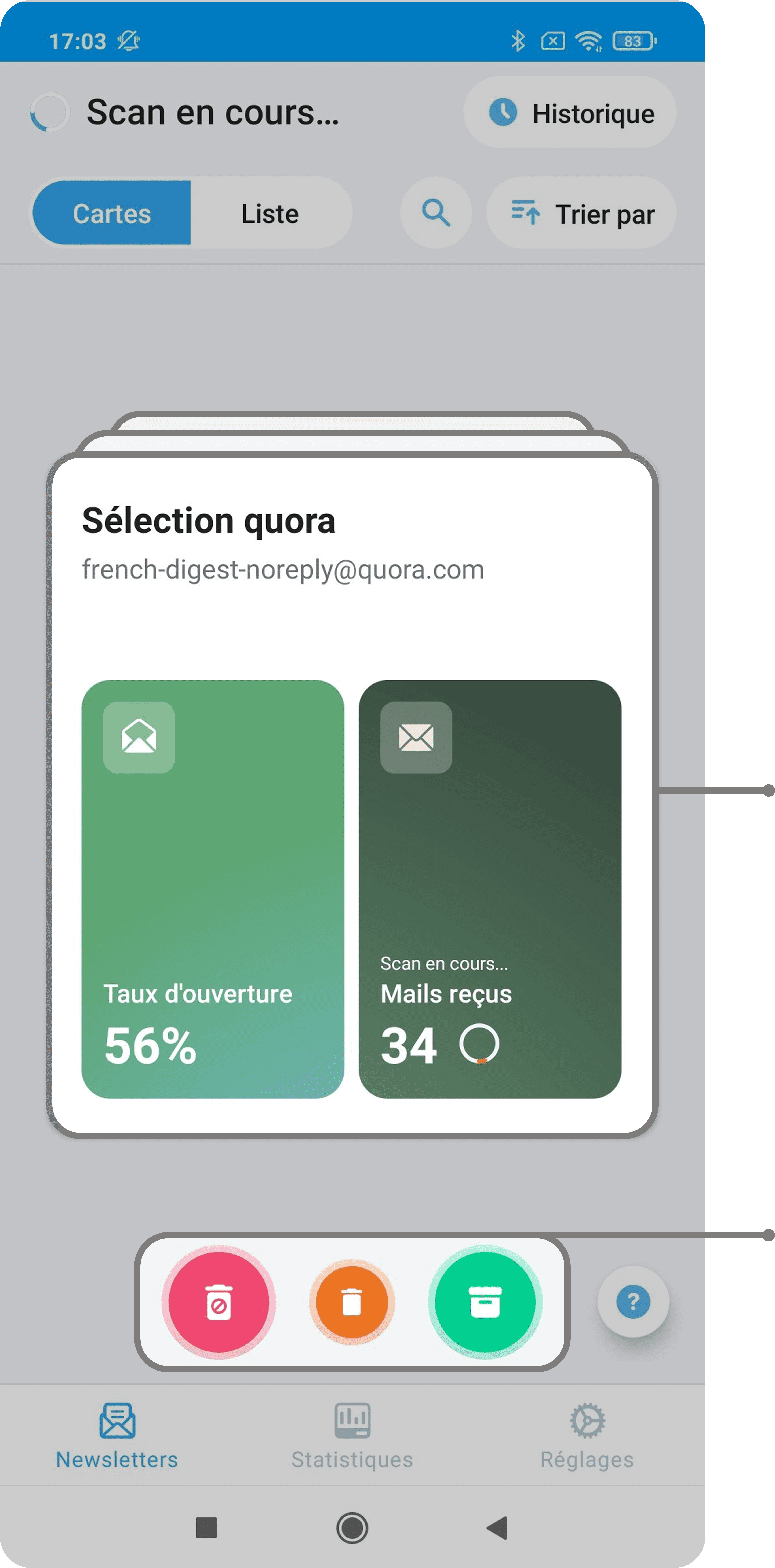
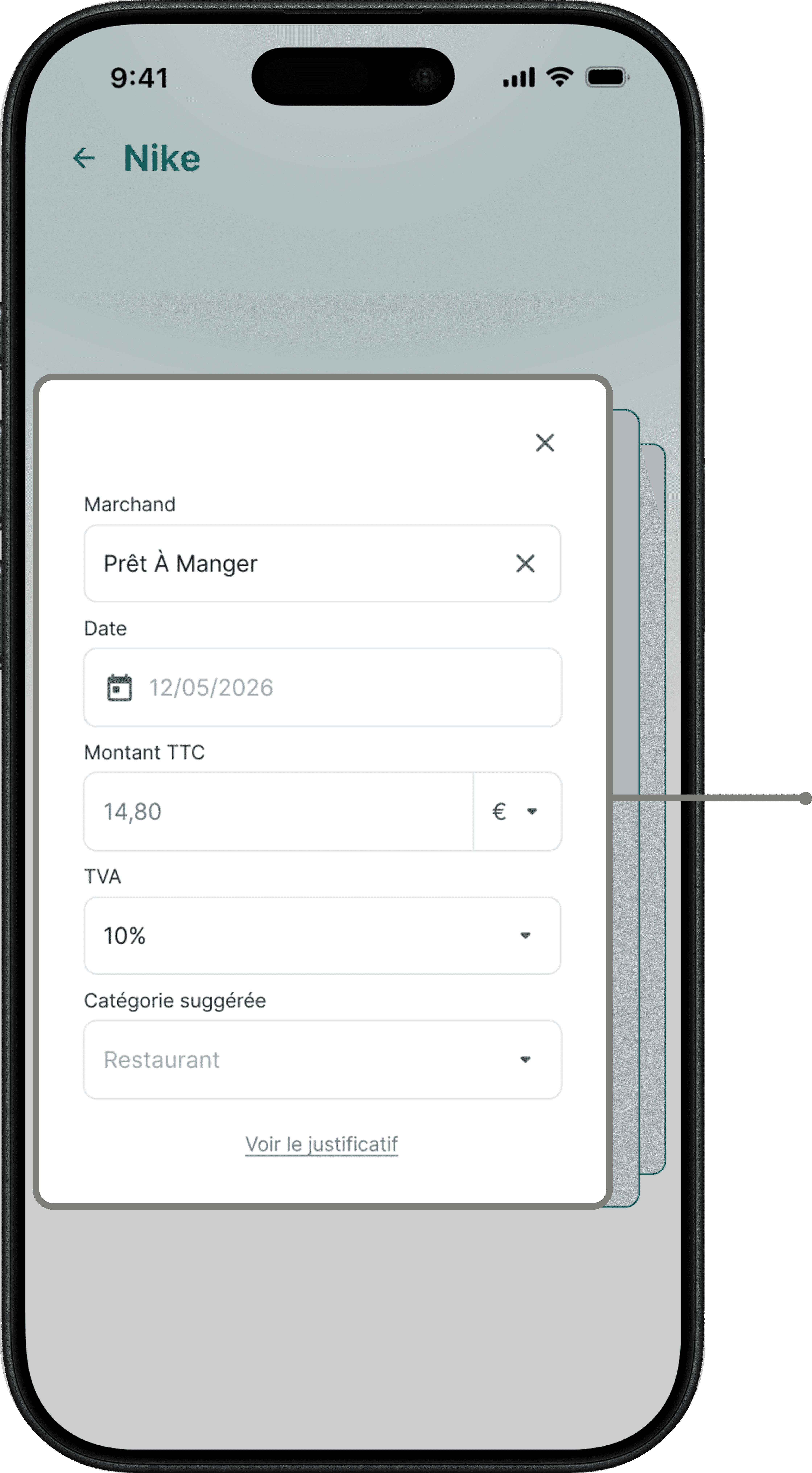
DESIGN RESPONSE #2

Let the system do the work

Let the system extract and pre-fill information, so users only review what requires their attention.

DESIGN RESPONSE #3

Reduce repetitive work

Reduce repetitive actions by enabling batch capture and submission.

05 ———— User testing

User testing

We tested our first concept with five participants to understand:

🟢 what reduced cognitive load

🟠 what still created friction

INSIGHT #1

INSIGHT #1

use signals

use signals

Batch workflow reduced repetitive work

Batch workflow reduced repetitive work

use signals

use signals

🟢 4/4 appreciated processing multiple expenses in a single workflow.

🟢 4/4 appreciated processing multiple expenses in a single workflow.

🟠 2/4 discovered batch capture without assistance.

🟠 2/4 discovered batch capture without assistance.

use signals

use signals

"Being able to scan several receipts at once is a real time saver."

"Being able to scan several receipts at once is a real time saver."

INSIGHT #2

INSIGHT #2

use signals

use signals

Reimbursement visibility made the process predictable

Reimbursement visibility made the process predictable

use signals

use signals

🟢 4/4 appreciated seeing reimbursement status at a glance.

🟢 4/4 appreciated seeing reimbursement status at a glance.

🟠 3/4 found some labels ambiguous.

🟠 3/4 found some labels ambiguous.

use signals

use signals

"You immediately know where it's blocked and what takes time."

"You immediately know where it's blocked and what takes time."

INSIGHT #3

INSIGHT #3

use signals

use signals

Exception-based review reduced manual work

Exception-based review reduced manual work

use signals

use signals

🟢 4/4 appreciated an exception-based workflow, where only uncertain information required manual review.

🟢 4/4 appreciated an exception-based workflow, where only uncertain information required manual review.

🟠 3/4 wanted to understand why some fields required their attention.


🟠 3/4 wanted to understand why some fields required their attention.


use signals

use signals

"You simply swipe to validate—it's much faster."

"You simply swipe to validate—it's much faster."

06 ———— V2

Iterating the experience

ITERATION #2

Make AI suggestions transparent

We made batch capture discoverable by making the mode explicit and providing clear progress and exit cues.

ITERATION #3

Clarify reimbursement visibility

We reduced ambiguity by clarifying amounts, statuses and next steps.

ITERATION #1

Make batch capture more discoverable

The interface now makes confidence explicit and only requests manual review when uncertainty exists.

07 ———— Personal refinement

Taking the concept further

The sprint ended with V2. I then independently pushed the concept further to explore how it could scale.

PERSONAL REFINEMENT #1

Separate tracking from organisation

I separated reimbursement tracking from expense organisation to reduce competing information and give each view a clear purpose.

V2

V2

Personal

Personal

PERSONAL REFINEMENT #2

From individual cards to a scalable overview

I revisited the information architecture to preserve reimbursement visibility as the number of expenses grows.

V2

V2

reimbursement visibility improved, but the overview remains amount-focused

reimbursement visibility improved, but the overview remains amount-focused

detailed progress cards work for a few expenses, but don't scale well

detailed progress cards work for a few expenses, but don't scale well

Personal

Personal

expenses are grouped by status for an at-a-glance overview

expenses are grouped by status for an at-a-glance overview

search and filters make larger volumes manageable

search and filters make larger volumes manageable

required actions stand out without opening each expense

required actions stand out without opening each expense

PERSONAL REFINEMENT #3

Bring required actions to the user

I extended notifications beyond status updates to surface issues that require user attention.

V2

V2

notifications only communicate status updates

notifications only communicate status updates

Personal

Personal

notifications evolved from passive status updates to actionable alerts

notifications evolved from passive status updates to actionable alerts

PERSONAL REFINEMENT #4

Let the workflow adapt to user behaviour

Instead of asking users to choose a capture mode, the flow automatically adapts when multiple receipts are captured.

V2

V2

V1

V1

users must choose a capture mode upfront

users must choose a capture mode upfront

Personal

Personal

a second capture automatically creates a batch

contextual feedback "Ready for the next scan" encourages users to keep scanning

a second capture automatically creates a batch

contextual feedback "Ready for the next scan" encourages users to keep scanning

08 ———— Final experience

Final prototype

This final prototype combines the team’s iterations and my personal refinements into a complete end-to-end flow.

09 ———— Success metrics

KPIs

As the concept wasn't shipped, these metrics define how I would evaluate whether the experience actually reduces the burden of expense reporting.

↓ TIME TO SUBMIT

Median time from receipt capture to expense submission.

↓ TIME TO SUBMIT:

Median time from receipt capture to expense submission.

↓ MANUAL CORRECTION RATE

↓ MANUAL CORRECTION RATE:

% of automatically pre-filled expenses requiring user correction.

% of automatically pre-filled expenses requiring user correction.

↓ EXPENSES RETURNED BY FINANCE

↓ EXPENSES RETURNED BY FINANCE:

% of submitted expenses requiring correction or additional information (Baseline: 30% → Success = decrease)

% of submitted expenses requiring correction or additional information (Baseline: 30% → Success = decrease)

↑ REIMBURSEMENT UNDERSTANDING

↑ REIMBURSEMENT UNDERSTANDING:

% of users who correctly understand reimbursement limits, current status and next steps.

% of users who correctly understand reimbursement limits, current status and next steps.

10 ———— Going further

Next opportunities

The employee experience is only one part of the reimbursement journey. I identified three opportunities to further reduce manual work and extend the experience across the wider workflow.

Next opportunities

🔄

Design the other side of the workflow

Explore manager and Finance workflows to improve approvals, exception handling and communication.

📅

Connect expenses to work context

Use calendar and business-trip context to suggest projects and clients automatically.

🔔

Make required actions proactive

Extend in-app alerts to contextual push notifications when an expense requires attention.

Reflection

AUTOMATION ISN'T ENOUGH

Reducing cognitive load wasn't only about automating tasks. It also meant reducing decisions and directing attention to what actually required user input.

VISIBILITY NEEDS STRUCTURE

Making more information visible doesn't necessarily make a process clearer. Hierarchy and progressive disclosure became essential as the experience grew.

DESIGN BEYOND THE HAPPY PATH

Designing for errors, uncertainty and required actions proved as important as designing the ideal submission flow.

More Projects

Create a free website with Framer, the website builder loved by startups, designers and agencies.